Class:
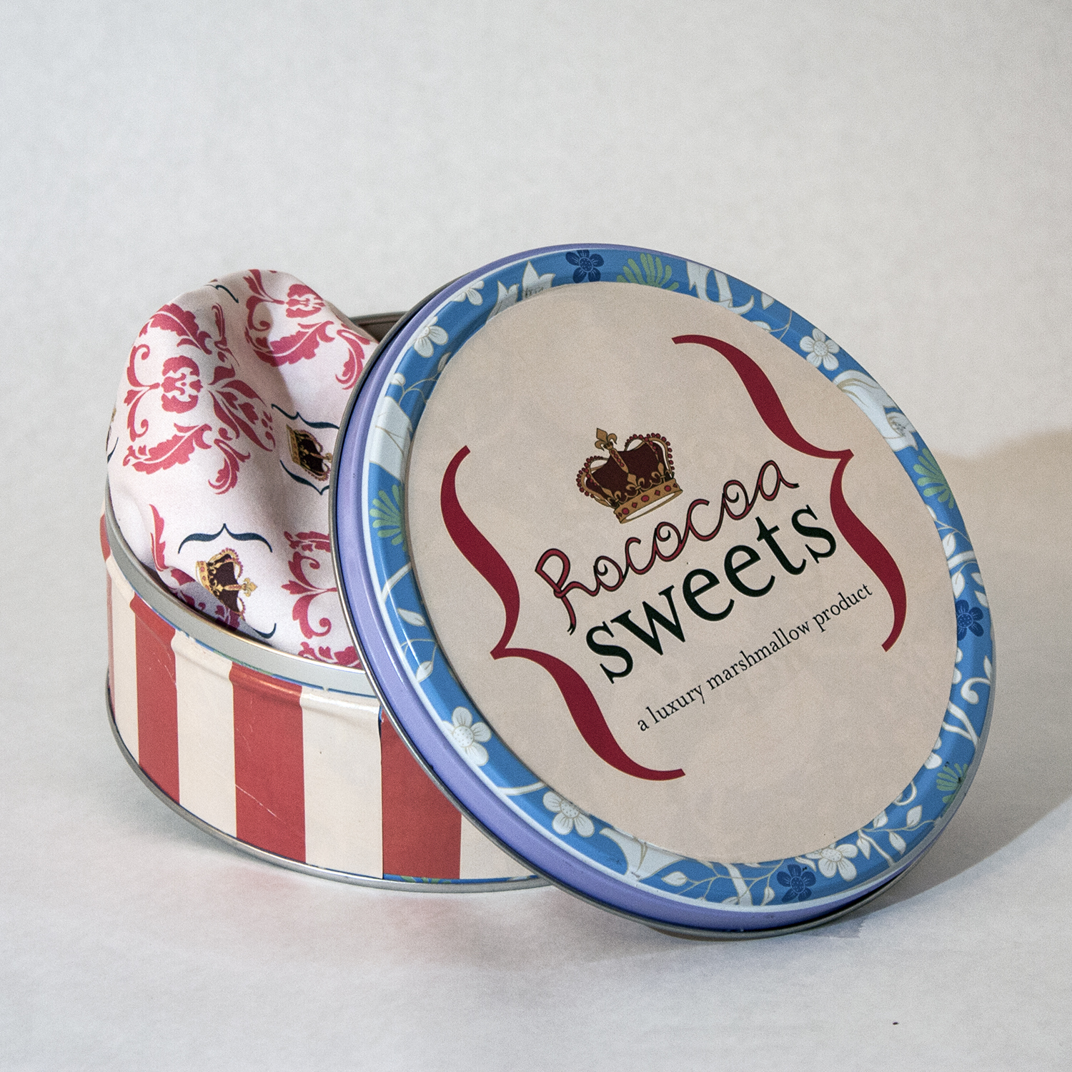
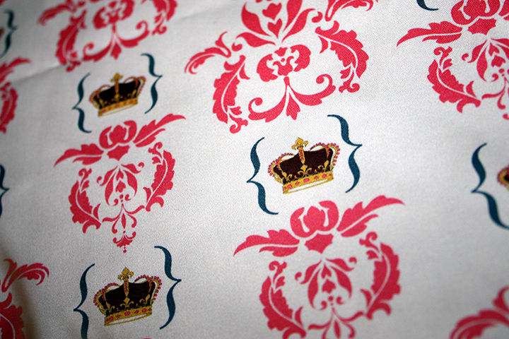
Visual CommunicationI began this project by identifying a package that I felt was poorly designed. I chose marshmallows because the packages are wasteful plastic rectangles with regrettable graphics. I chose to design a more elegant and sustainable package for marshmallows with graphics inspired by the French Rococo period. The logotype combines hand-lettering (inspired by the gratuitous use of ribbons as a sign of conspicuous consumption at the time) with the elegant Mrs. Eaves. The package is made from a aluminum and organic cotton and is 100% reusable and recyclable.


